Old is New - Belly Crisis
It's time to revisit some of my older works, recreate them, and then look at them side by side to see how they compare!
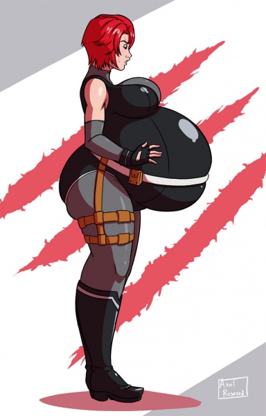
-Big thing here is anatomy, anatomy, anatomy. The improvements are pretty clear when you look at the face and arms especially. In the original image, Regina's arms are way too thin and twiggy, and her face is all misshapen and weird looking.
-Full body view rather than cutting off at the knees helps give a better idea overall of her size and shape.
-I'm way more on model this time, which means details such as her hair and outfit are more accurate. Bare bellies are nice, but Regina's actual outfit makes for some nice visuals as it stretches around her swollen frame.
-Background adds a little extra spice.
-Also yeah she's bigger too.
