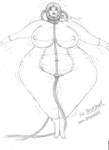
Your drawings are very good when looking at them at normal size.
The problem is that they don't catch my attention when looking at them at thumbnail size. I got here through the recent comments page.
Maybe it would help if you managed to get a little more contrast with black at some areas, and thickenning and darkenning a bit more some lines.
Here's a drawing that caught my attention in thumbnail size: http://www.bodyinflation.org/node/8870

Well, I like hoses and full body suits. But that doesn't really matter. The best themes are probably the ones you feel like doing :)